Inside Cover

Page 01

2014-2017 by Caryn Esplin
CREATIVE DIRECTOR:
Emily Kunz
WEB DESIGNER:
EDITORS:
Emily Kunz
Ron Bennett
Shilo Goodson
PROOFREADER:
Rachel Esplin Odell
Nicole Nugent
PHOTOGRAPHY & ILLUSTRATIONS:
Most images and graphics created by Caryn Esplin, with some work from content contributors.
CONTENT CONTRIBUTORS:
Emily Kunz, Katie Anderson, Christina Aragona,
Tim Wood, Nicole Nugent
Copyright © 2014-2017 by Caryn Esplin.
First Edition: January 2014
Published by Custom Designs
ISBN-13: 978-1494458171
ISBN-10: 1494458179
All rights reserved. All original images, illustrations, and work are copyrighted by the author. No part of this book may be reproduced, stored in a retrieval system, or transmitted in any form, or by any means, electronic, mechanical, photocopying, recording, or otherwise, without prior permission of the author.
Page 02

HERE’S TO YOU!
I dedicate this book to all my incredible students at BYU-Idaho, for their enthusiasm, love of learning, hard work, and encouraging words.
Page 03
 ACKNOWLEDGMENTS
This book is a compilation of experiences from several years. The first “big idea” for the FOCUS acronym came as inspiration, so I would first like to express gratitude to my Creator for His guidance. Next, I want to thank Emily Kunz for believing in me. She had a profound influence on this book as my creative director and chief editor. Emily stayed positive through the sometimes-grueling tasks. Her tireless efforts, layout/editing skills, good design taste, and sense of humor made this whole process worth tackling.
I would like to acknowledge four mentors in the BYU-Idaho Communication Department who trained me and have always supported me through the years: Robyn Bergstrom, Ron Bennett, Mike Cannon, and Lee Warnick. They have changed the lives of so many students and faculty. It is a privilege to learn from them and work with them.
I have been fortunate over the years to work with an amazing team of teaching assistants. Many of them helped with course content design and taught me many things through the process. Every single one of my assistants have been life-savers to me.
I will always be grateful to several people who were willing to help during the final crunch time with this book. Ron Bennett and Shilo Goodson came through with excellent editing skills. Julie Peterson, Eric Lybbert, and Katie Anderson took time during finals week to design illustrations, create examples, and capture images. I am also grateful for my daughter, Rachel Odell, and friend, Kris Hart, who were willing to proofread at the bitter end. Also, my daughters, Zoe Esplin and Janel Hafen, who filled in to help me out with family events.
My dear husband, Keith, has been an anchor in my life and so encouraging throughout this process. Our four children, their spouses, and eight grandchildren bring us so much joy. I am grateful for the good people they are. I have the most amazing parents who taught me I could do anything I set my mind to. Even though my mother and sister are gone, I still feel their love and support daily. My father is the most positive and happy person I know. At 90, he loves his life and makes the most out of every day. I love my family. I am so grateful for all who have encouraged me and helped me with this book. I look forward to future projects!

Page 04 & 05

Page 06
CONDENSED
CONTENTS
![]()
40
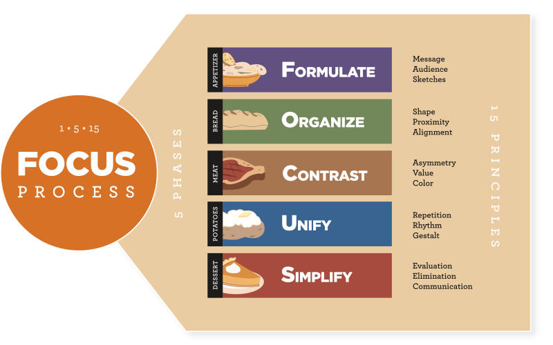
3. Formulate a PlanMessage: Identify one central message.Audience: Determine what will influence the audience.Sketches: Make sketches of your best ideas.
![]()
62
4. Organize the LayoutShape: Organize negative and positive space.Proximity: Group similar items to create visual flow.Alignment: Arrange elements to create visual connections.
![]()
102
5. Contrast the ElementsAsymmetry: Use unpredictable, dynamic balance.Value: Add variations of light and dark.Color: Control perception of hues and light.
![]()
158
6. Unify the PartsRepetition: Repeat elements to create unity.Rhythm: Create patterns at intervals.Gestalt: Unify the parts to create a greater whole.
CONTENTS


Chapter 1


Chapter 3
-
Formulate a Plan
40
-
-
INTRO: Don’t skip the appetizer.
42
-
PRINCIPLE 1: MESSAGE
44
-
Don’t forget to communicate.
46
-
Ask: What am I trying to say?
47
-
Save ideas in a design file.
48
-
Connect with the client.
50
-
PRINCIPLE 2: AUDIENCE
52
-
Create an audience profile.
53
-
Search for inspirational images.
55
-
PRINCIPLE 3: SKETCHES
56
-
Gather ideas.
56
-
Find the right environment.
57
-
Brainstorm new ideas.
58
-
Exercise: Sketching
59
-
Key Questions & Quick Review
60
-

Chapter 4
-
Organize the Layout
62
-
-
INTRO: Organizational workflow.
66
-
PRINCIPLE 1: SHAPE
70
-
Create shape maps.
72
-
Respect white space.
74
-
Group white space.
76
-
Treat white space as a shape.
78
-
Beware of trapped white space.
80
-
Value white space.
82
-
PRINCIPLE 2: PROXIMITY
84
-
Add grouping to create relationships.
85
-
Create a focal point and hierarchy.
86
-
Use flow to lead viewers through the design.
88
-
Choose leading that sends the right message.
90
-
Use tracking and kerning to communicate.
92
-
PRINCIPLE 3: ALIGNMENT
94
-
Follow the six rules of alignment:
95
-
Align everything with something else.
95
-
Try diagonal alignment to add balance.
96
-
Avoid the overuse of center alignment.
97
-
Follow the rule of thirds.
98
-
Use creative alignments sparingly.
99
-
If you can align, do! If not, have a good reason.
99
-
Key Questions & Quick Review
100
-

Chapter 5
-
Contrast the Elements
102
-
-
INTRO: Ten ways to get bold!
106
-
PRINCIPLE 1: ASYMMETRY
108
-
Bend the rules. Balance is boring.
108
-
Find new ways to peel a banana.
110
-
Break the grid.
112
-
Vary shapes.
114
-
Contrast typefaces.
116
-
Follow the general rule of typography.
118
-
PRINCIPLE 2: VALUE
120
-
Place values for best interaction.
121
-
Use value contrast for hierarchy.
122
-
Exercise: Contrast
123
-
Remember, color has value.
123
-
Add emotion with chiaroscuro.
124
-
PRINCIPLE 3: COLOR
126
-
Learn basic color theory.
126
-
Understand how light affects color.
127
-
Learn color properties.
128
-
Grasp color modes.
130
-
Select harmonious color schemes.
132
-
Exercise: Match Color Schemes
141
-
Create custom color swatches.
148
-
Exercise: Mixing Digital Colors
151
-
Use colors from an image.
152
-
Avoid troublesome combinations.
154
-
Key Questions & Quick Review
156
-

Chapter 6
-
Unify the Parts
158
-
-
INTRO: Find the right balance.
162
-
PRINCIPLE 1: REPETITION
164
-
Repeat and complete.
166
-
Remember repetition in branding.
168
-
Use the “rule of odds.”
170
-
PRINCIPLE 2: RHYTHM
172
-
Use regular patterns for safe rhythms.
172
-
Try irregular rhythms for bolder statements.
172
-
PRINCIPLE 3: GESTALT
174
-
Exercise: Gestalt
176
-
Prioritize the focal point.
178
-
Bring things together.
180
-
Key Questions & Quick Review
182
-

Chapter 7
-
Simplify the Message
186
-
-
INTRO: Interact with others.
186
-
PRINCIPLE 1: EVALUATION
188
-
Gather critiques.
190
-
Praise every good thing.
191
-
Follow the Four-Step Critique Model.
193
-
Tips for the Four-Step Critique Model.
194
-
PRINCIPLE 2: ELIMINATION
202
-
Find the clutter.
203
-
Trash your junk food.
204
-
PRINCIPLE 3: COMMUNICATION
206
-
Create an audience-centered design.
208
-
Communicate your message.
209
-
Craft a cohesive message and design.
209
-
Think outside the box.
210
-
Key Questions & Quick Review
212
-

Chapter 8
-
Tasteful Typography
214
-
-
Introduction
216
-
History of typography
221
-
New developments
224
-
Principles of typography
225
-
Type categories
225
-
Type terminology
226
-
Anatomy of a letterform
227
-
Rules of typography
230
-
The blacklist
250
-
Rules of body copy
251
-
Page 07
Introduction

Visual FOCUS: The Five-Step Design Process
Page 12 & 13
Introduction 
VISUAL FOCUS
Welcome to Visual FOCUS, a unique design approach that blends communication and art perspectives. Visual communication is my personal and professional passion. As a visual media professor, I enjoy facilitating students in their quest to become skilled visual communicators and professionals.
I wrote this book for college students and anyone else who wants to learn a well-rounded approach to design. Through the Visual FOCUS process readers will discover how to balance the design with the message. They can become a valued asset to any organization or company with improved visual communication skills and learn to connect with an audience and produce results.
Each chapter in this book follows a theme with colors, icons, photography, design examples, helpful tips, exercises, and even food analogies to help enhance the learning experience. Readers will find a chapter outline at the start of each chapter for a quick overview.
The first two chapters set the foundation. Then the five phases of the FOCUS process are presented in chapters 3 through 7. At the end of each of these five chapters, readers can engage in active learning as they answer “key questions” and check their learning through a “quick review.”
I learn new things from my students each semester as we study current trends in visual communication. Feel free to see my work at www.carynesplin.com.

Page 14

Page 15

